Note to self - do some FLIPPIN WOOOORK!!
Happy New Year xGx
Thursday, 31 December 2009
Tuesday, 24 November 2009
Open Studioooo
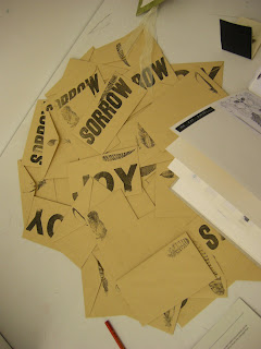
My Superstition work so far... The latest development are these little envelopes. The idea is they have a hand-drawn bird's feather printed on them and then the 'sorrow' or 'joy' refers to the superstitions of that particular bird. There are 13 possible bird feathers to chose from.


 The latest development are these little envelopes. The idea is they have a hand-drawn bird's feather printed on them and then the 'sorrow' or 'joy' refers to the superstitions of that particular bird. There are 13 possible bird feathers to chose from.


Friday, 16 October 2009
Dastards - 7 day project
For this one week project we had to make up our own film in groups and then create an AO poster each.
We all found an interest in the general plot of Disney films and decided to create a film that followed the Disney "Formula" of plot and characters, but in the style of a Documentary. The result was a kind of Anti-Disney Mockumentary.
I aimed to reference Disney whilst making the poster as far away from the classic Disney style as possible. I created this design resembling the Rorschach ink blot test to highlight the dark side of Disney.


The Feedback was good - basically, all elements tie in together well and create a good "feel". It's slow-hitting and subtle, drawing viewers attention in - the title needs some adjustment, so i will try and work this out!
Tuesday, 13 October 2009
Peace x
Superstition project again. Looking at symbols of luck and in particular the many superstitions about birds. Cranes are a symbol of peace and good fortune. I made 101 out of different pieces of paper-from white flock paper to old receipts. Then chained them together in this little 'book'.


Owlies
For my Superstition project. I believe owls are good luck, so each day I make a random ink blot and then try to turn it into an owl... simplez


Friday, 26 June 2009
The Degree Show


Saturday, 13 June 2009
The Time has come!
 This is the final instillation of the Time Machine project. The twelve chapters of the book are arranged in order in the form of a clock face, with the positive and negative text arranged onto mirrors. The 'neutral' text is pinned up in a similar formation on the wall behind, acting like the shadow of a sundial...


Its all smoke and mirrors...
I separated the text into positive and negative text, fitting it onto these 15x15cm mirrors. The idea is that this draws attention to the subjective opinions of the Time Traveller. When you look at the text, you will be confronted by your own image, allowing for a moment of self-reflection (sorry about the pun)...


Subscribe to:
Posts (Atom)
